Responsive Web Design
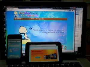
Website www.babyplaylearn.com kami yang terbaru menggunakan metode “Responsive Web Design“.
Website yang sama diakses menggunakan media yang berbeda (portrait / landscape).
Dari wikipedia:
Responsive Web Design (RWD) essentially indicates that a web site is crafted to use Cascading Style Sheets 3 media queries, an extension of the @media rule[1], with fluid proportion-based grids (which use percentages and EMs instead of pixels)[2], to adapt the layout to the viewing environment, and probably also use flexible images.[3][4][5] As a result, users across a broad range of devices and browsers will have access to a single source of content, laid out so as to be easy to read and navigate with a minimum of resizing, panning, and scrolling.
Untuk buku mengenai “responsive web design” yang sudah ada di Amazon:


Leave a Reply